- Retrait gratuit dans votre magasin Club
- 7.000.000 titres dans notre catalogue
- Payer en toute sécurité
- Toujours un magasin près de chez vous
- Retrait gratuit dans votre magasin Club
- 7.000.0000 titres dans notre catalogue
- Payer en toute sécurité
- Toujours un magasin près de chez vous
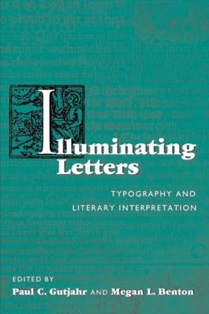
Illuminating Letters
Typography and Literary Interpretation
55,95 €
+ 111 points
Description
What do we read when we read a text? The author's words, of course, but is that all? The prevailing publishing ethic has insisted that typography-the selection and arrangement of type and other visual elements on a page-should be an invisible, silent, and deferential servant to the text it conveys. This book contests that conventional point of view. Looking at texts ranging from the King James Bible to contemporary comic strips, the contributors to Illuminating Letters examine the seldom considered but richly revealing relationships between a text's typography and its literary interpretation. The essays assume no previous typographic knowledge or expertise; instead they invite readers primarily concerned with literary and cultural meanings to turn a more curious eye to the visual and physical forms of a specific text or genre. As the contributors show, closer inspection of those forms can yield fresh insights into the significance of a text's material presentation, leading readers to appreciate better how presentation shapes understandings of the text's meanings and values. The case studies included in the volume amplify its two overarching themes: one set explores the roles of printers and publishers in manipulating, willingly or not, the meaning and reception of texts through typographic choices; the other group examines the efforts of authors to circumvent or subvert such mediation by directly controlling the typographic presentation of their texts. Together these essays demonstrate that choices about type selection and arrangement do indeed help to orchestrate textual meaning. In addition to the editors, contributors include Sarah A. Kelen, Beth McCoy, Steven R. Price, Leon Jackson, and Gene Kannenberg Jr.
Spécifications
Parties prenantes
- Editeur:
Contenu
- Nombre de pages :
- 216
- Langue:
- Anglais
- Collection :
Caractéristiques
- EAN:
- 9781558497627
- Date de parution :
- 04-02-10
- Format:
- Livre broché
- Format numérique:
- Trade paperback (VS)
- Dimensions :
- 152 mm x 229 mm
- Poids :
- 317 g

Les avis
Nous publions uniquement les avis qui respectent les conditions requises. Consultez nos conditions pour les avis.


